Free Website Audit UK – 2025 Checklist for Small Businesses

Discover What’s Holding Your Website Back – Speed, SEO, Mobile or Something Else?

A free website audit UK businesses can actually use — that’s the goal of this 2025 checklist. Whether you’re running a Shopify store, local service site, or brochure-style website, knowing what’s slowing you down or hurting your SEO is the first step to growth.

From mobile usability to speed, on-page SEO, conversion layout, and technical issues — many websites underperform without the owners realising it. This guide breaks it all down, step by step, with a checklist you can apply instantly or share with your web developer.

Bonus: At the end of this article, you’ll get access to a free audit tool that scans your website and emails you a custom report — built by the team at AdScaleo, tailored for UK small business needs.

✅ Step 1: Homepage Clarity & First Impression

A free website audit UK should always start with the most important page — your homepage. This is your digital front door. And just like a restaurant or retail store, if that first impression is messy, confusing, or forgettable… visitors will simply leave.

In under 5 seconds, your homepage should answer three questions without making the visitor scroll:

  • 🧭 What do you offer?
  • 👤 Who is it for?
  • 🎯 What should they do next?

Think of a local bakery in Manchester. Their homepage should show fresh product images, mention "Handmade Cakes in Manchester" clearly in the hero text, and include a CTA like “Order Online” or “View Menu” — right at the top. If instead it just shows a stock image with no clear offer or action, most people will bounce.

Weak Homepage (Example) Strong Homepage (Example)
“Welcome to our website” headline “Fresh Cakes Delivered in Manchester – Order Online”
No call-to-action above the fold Visible “Order Now” button with contact details
Stock banner image with no context Real image of the bakery or products

This step alone can drastically reduce bounce rate and increase conversions — especially for small businesses in the UK trying to stand out in local searches. According to this CXL study, first impressions are 94% design-related and formed within milliseconds.

Visual example of a UK small business homepage layout used in Step 1 of our free website audit UK guide – highlighting strong headline, CTA, and clear structure

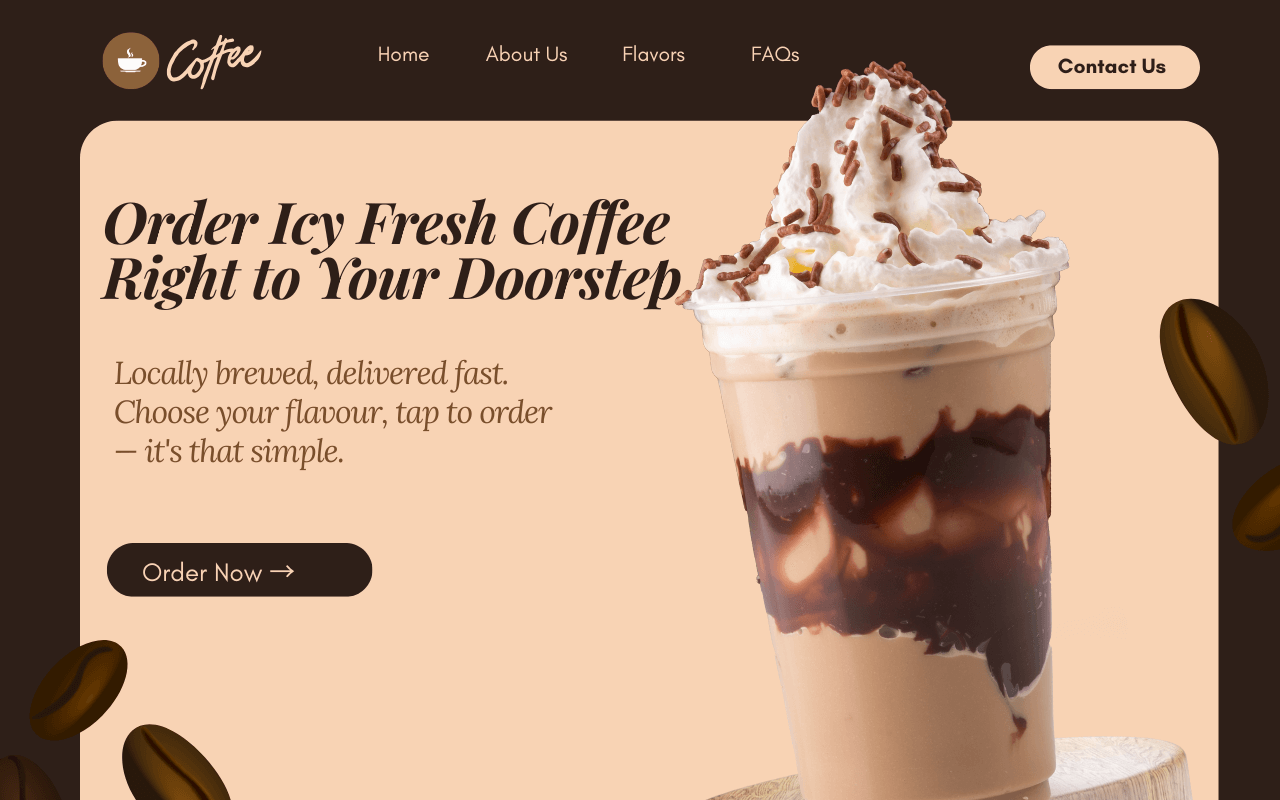
Example: A strong homepage design from a local coffee shop – clear headline, subheading, and action button visible instantly.

💡 Pro Tip: During your audit, ask someone outside your business to view the homepage for just 5 seconds — then ask them what your business does. If they can’t answer clearly, it’s time to refine this section.

✅ Step 2: Clear Navigation & Action Paths

A strong free website audit UK process doesn’t stop at visuals — it dives into usability. One of the biggest silent killers of conversions is poor site navigation. If your visitors feel lost or overwhelmed, they’ll drop off before taking any meaningful action.

Your website's menu should act like a helpful shop assistant: guiding users logically through your services, products, or information. Every second a user spends figuring out “where to click next” is a moment of potential friction — and lost revenue.

For UK businesses, this means having a simple, consistent menu with key CTAs visible — especially on mobile. Below is a comparison of what we commonly see during our audits:

Navigation Mistakes Optimised Navigation
Too many dropdown options confusing the user Simple menu with 4–6 key items, no clutter
Missing “Contact”, “About” or “Services” in header Clear CTAs like “Get Quote”, “Call Now”, or “Free Audit”
Inconsistent design for buttons, hard to notice One style for all CTAs (color, shape, font)
Mobile menu hidden or broken Sticky mobile menu with icons for call/chat
No internal linking between key pages Smart contextual links like “See our work” → Case Studies

Bonus tip: Always test your navigation on multiple devices. What looks clean on desktop might feel clunky or invisible on mobile. Try using Google's Mobile-Friendly Test to validate usability and fix any overlapping elements or broken menus.

💡 Pro Tip:

If your bounce rate is high and time-on-site is low, your navigation may be the problem — not your content. A/B test your menu and observe changes using tools like Hotjar or Microsoft Clarity.

✅ Step 3: Highlight Benefits Above the Fold

Any free website audit UK worth its salt must check how effectively your website communicates value — and fast. Most small business websites bury their key strengths too low on the page, hoping users will scroll. But most don’t.

A strong homepage should make your top 2–3 benefits immediately visible “above the fold” — the screen area users see before they start scrolling. Think of it like your shop window. If it doesn’t spark interest at a glance, they’ll pass by.

Example of clear homepage layout for free website audit UK

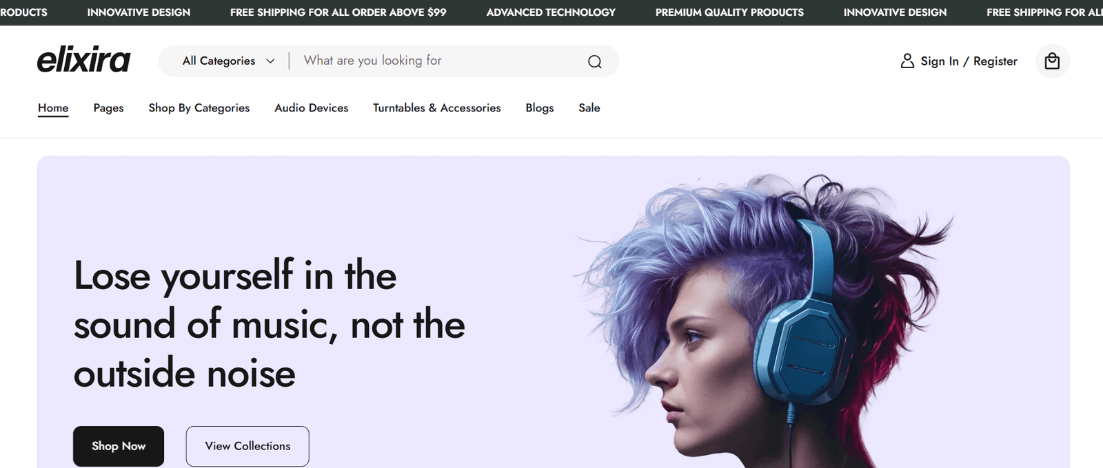
📸 Real example: This shop homepage shows clear offers, info, and action button — all above the fold.

For example, if you’re a local gym in Leeds, don’t wait until halfway down the page to mention “Free Trial Class” or “No Joining Fee”. Your headline, subheading, and CTA should reflect those benefits right away — before scrolling.

According to data, mobile accounts for over 58% of global web traffic. If your homepage doesn’t instantly grab attention on mobile, you’re likely missing out on most users — especially in the UK where mobile-first design is the norm.

💡 Pro Tip:

On mobile, test your website with a simple rule: If users can’t understand your offer in 3 seconds or less — with one thumb and no scroll — it’s time to restructure your hero section.

✅ Step 4: Mobile Responsiveness Matters More Than Ever

Over 60% of website traffic in the UK now comes from mobile devices. A free website audit UK must check how your site performs on different screen sizes — especially smartphones.

If your navigation menu is broken, text overflows off-screen, or buttons are hard to tap — users will leave instantly. Even worse, Google ranks non-mobile-friendly websites lower in mobile search results.

Poor Mobile UX Mobile-Friendly UX
Text too small or cut off on screen Responsive font sizes and spacing
Menus that don’t open on tap Slide-out or dropdown mobile nav menus
Buttons too small or placed too close Large, well-spaced CTA buttons
No mobile-optimised layout (e.g. swipe sliders) Touch-friendly design with scroll/swipe support

Tools like Google’s Mobile-Friendly Test and PageSpeed Insights are great for spotting issues. But the best way to audit is simple — open your site on your own phone, try every button, and scroll every page.

If your site feels clunky or confusing on your phone, chances are it’s even worse for your customers.

🚀 Step 5: Check Your Website's Page Speed & Core Web Vitals

Site speed is a major factor in both user experience and SEO performance. A slow-loading website frustrates visitors and signals to Google that your site may not be optimised for mobile users — especially in the UK, where users expect near-instant access on all devices.

Your homepage and top-performing service pages should ideally load in under 3 seconds and pass Google’s Core Web Vitals — including First Contentful Paint (FCP), Largest Contentful Paint (LCP), and Cumulative Layout Shift (CLS).

Page speed insights mobile performance score from free website audit UK

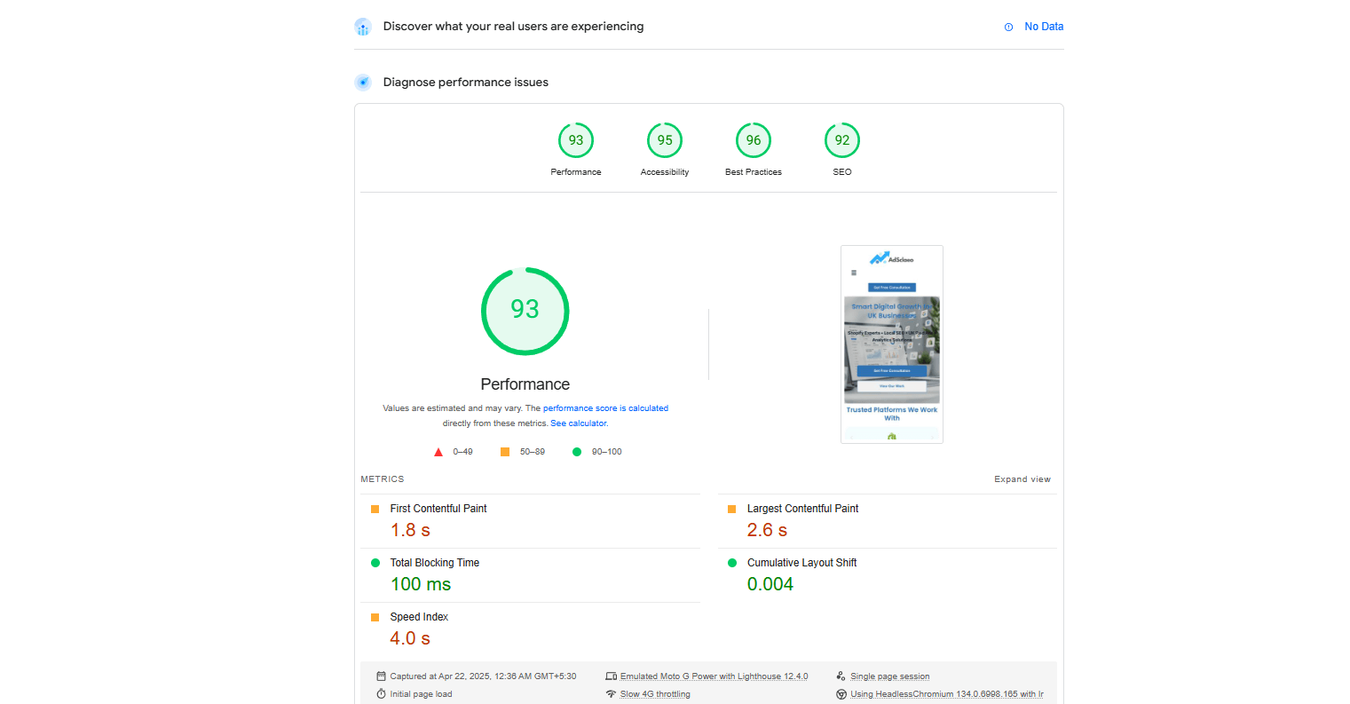
Screenshot: Real Google PageSpeed score for AdScaleo.com on mobile (91/100 performance)

Metric Recommended Needs Attention
First Contentful Paint (FCP) ≤ 1.8s > 2.5s
Largest Contentful Paint (LCP) ≤ 2.5s > 4s
Cumulative Layout Shift (CLS) ≤ 0.1 > 0.25
Total Blocking Time ≤ 200ms > 600ms

💡 Pro Tip: Test your homepage, services, and landing pages on both desktop and mobile separately. Mobile performance often suffers the most, especially with large hero images, embedded videos, or unoptimised scripts.

✅ Step 6: Fix Weak Navigation & Internal Linking Gaps

If users or Google can’t find your most important pages quickly, your bounce rate increases and your SEO authority drops. A solid navigation structure and effective internal linking are essential components of any free website audit UK process.

Google recommends creating a logical link structure and making important pages easily accessible. This helps distribute PageRank and keeps users engaged. Read their official guidance in the Google Search Essentials.

Review your current menu, footer links, and blog-to-service connections. Here's a comparison of weak vs strong navigation and internal linking systems:

Poor Navigation & Linking Strong Navigation & Linking
Important pages hidden 4+ clicks deep Service pages accessible in 1–2 clicks
Generic labels like “Info” or “Stuff” Clear labels like “SEO Services” or “Google Ads”
No links between related blogs or services Blog articles link to services and case studies
Same anchor text repeated (“Click Here”) Descriptive anchor text like “See Shopify SEO tips”

💡 Pro Tip: Use Google Search Console’s “Links” report to identify underlinked pages — and add contextual links to strengthen their visibility and authority.

Internal links are one of the most underrated on-page SEO tactics. They improve crawlability, boost average session time, and help pass authority to pages that matter most — especially your lead-gen offers or contact page.

✅ Step 7: Add Clear, Action-Driven CTAs on Every Key Page

One of the most common issues we find during a free website audit UK is the absence of a clear CTA. Whether you want people to call you, book a service, or fill a lead form — they need visual, clear next steps.

The CTA should match the page’s intent. On your homepage, it might be “Get a Free Quote”. On a service page, “Book a Free Strategy Call”. On blogs, a subtle but visible “Need Help? Here’s how to make a business website that converts” works well.

Place CTAs at the top, middle, and bottom of long pages. Don’t make users hunt for how to contact you. Also make sure buttons and links are visible, mobile-friendly, and action-focused.

Weak CTA Usage Strong CTA Usage
No visible CTA above the fold Bold CTA button top-right or hero section
Generic text like “Submit” Specific text like “Get Free Audit Report”
Only one CTA at the bottom Multiple CTA placements throughout
No action suggestion on blogs Blog links to services or next steps

💡 Pro Tip: Use tools like Hotjar or Microsoft Clarity to see where users click — if they’re missing your CTA, it’s time to reposition or redesign it.

CTAs drive conversions. Without them, your beautifully built site becomes just an online brochure. Make it easy for visitors to take the next step — and guide them confidently through the journey.

🎯 Wrapping Up: Smarter Websites Start with Smarter Audits

A free website audit UK isn’t just about fixing issues — it’s about unlocking growth. From homepage clarity to page speed, mobile responsiveness, SEO health, and CTAs, each step helps you turn your site into a real business asset.

If you're unsure where to start, or want expert eyes on your site — our team is here to help with honest, no-pressure guidance tailored for UK small businesses and eCommerce brands.

Ready to find out what’s holding your site back? Let's run your personalised audit today.

🛠️ Get a Free Website Setup Audit →

✅ Want to dive deeper? Explore our full guides and services: SEO Services, Analytics & Reporting, and Content Writing Services.

×

🚀 Free Website Audit for UK Businesses

We'll analyse your site’s speed, SEO, and tracking — and send custom tips within 48 hours.

💡 Claim My Free Audit ⏳ Only a few audit slots left this week!
Scroll to Top